
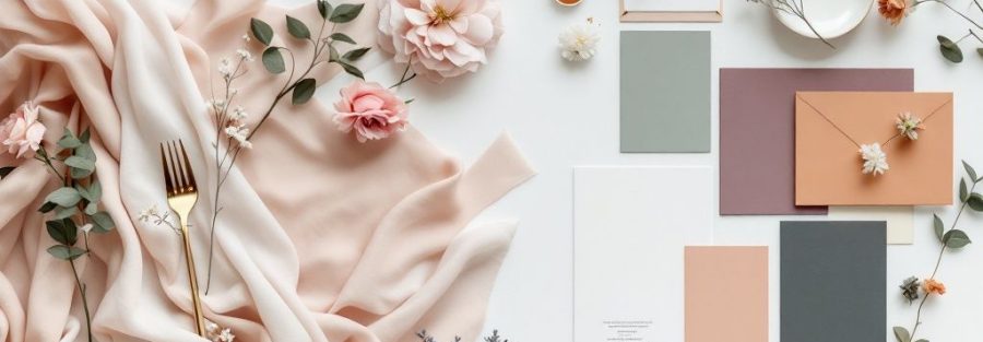
Choosing the Perfect Wedding Colors
Your wedding color scheme sets the tone for your entire celebration. This listicle provides eight stunning wedding color schemes for 2025, ranging from classic elegance to modern romance. Whether you're planning a wedding, corporate event, or private party, these inspiring combinations will help you create the perfect atmosphere. Discover trending palettes like dusty blue and sage, burgundy and blush, and navy and copper, plus timeless classics like white and gold and black and white. Find the perfect wedding color schemes to bring your vision to life!
1. Classic White and Gold
When it comes to wedding color schemes, you can't go wrong with the enduring elegance of white and gold. This classic pairing symbolizes purity, opulence, and celebration, creating a sophisticated atmosphere perfect for any setting, from a grand ballroom to a rustic barn or a beachside ceremony. The beauty of this scheme lies in its versatility. The neutrality of white acts as a blank canvas, allowing the warm glow of gold to truly shine. This adaptability makes white and gold a fantastic choice for any season, effortlessly transitioning from spring’s fresh blooms to winter’s snowy landscapes while maintaining a luxurious feel. Whether you're dreaming of a lavish affair or a more intimate gathering, white and gold provides a timeless backdrop for your special day, ensuring your wedding photos remain stunning for years to come.
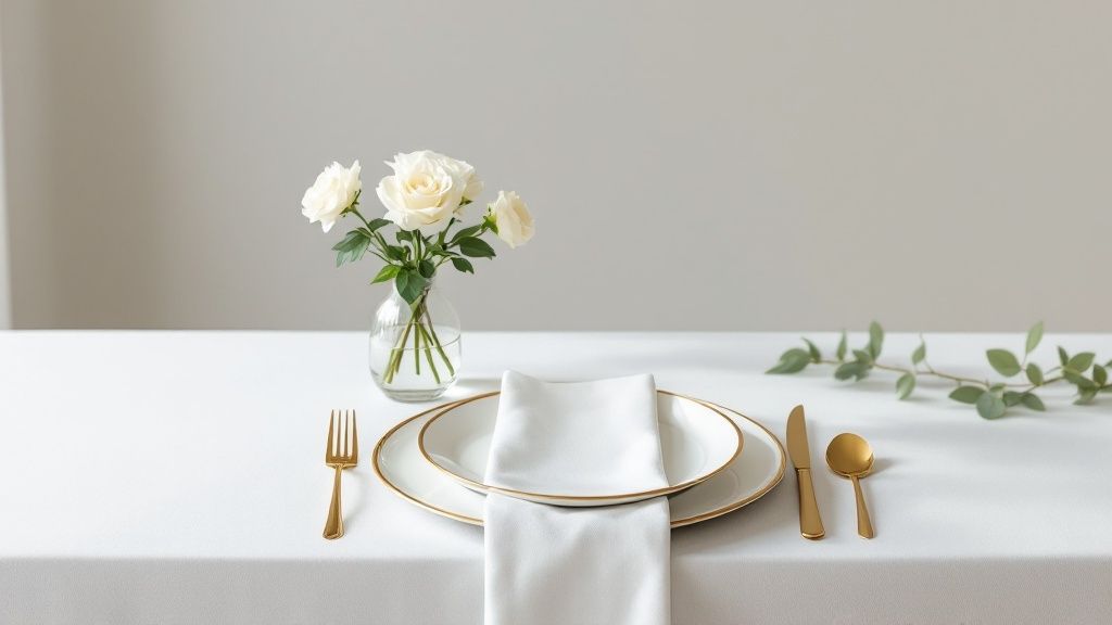
This classic combination has graced countless memorable weddings, including high-profile celebrations like Kim Kardashian and Kanye West's 2014 nuptials and the royal wedding of Catherine, Princess of Wales (Kate Middleton), both of which incorporated white and gold elements to stunning effect. Luxury venues like The Plaza Hotel in New York frequently host white and gold themed weddings, showcasing the timeless appeal of this color scheme. This enduring popularity makes sourcing decorations and attire remarkably easy, contributing to a cohesive and polished look without requiring excessive effort.
Why White and Gold Deserves Its Place at the Top:
- Timeless Elegance: This color palette never goes out of style, ensuring your wedding photos remain chic and sophisticated for years to come.
- Versatility: Adaptable to any season, venue, or theme – from modern minimalist to traditional grandeur.
- Bright and Airy Atmosphere: Creates a light and inviting ambiance that photographs beautifully in any lighting.
- Adaptable Budget: Works equally well for modest and extravagant budgets.
- Complementary: Flattering to most skin tones and enhances most floral arrangements.
Pros:
- Easy to source decorations and attire.
- Creates a cohesive, polished look effortlessly.
- Complements most floral arrangements.
- Flattering to most skin tones.
- Scalable from modest to extravagant budgets.
Cons:
- Can feel conventional for some couples.
- White elements require careful maintenance.
- Can appear flat without thoughtful design.
- Can feel cold without warm lighting or accents.
Tips for Rocking White and Gold:
- Add Dimension: Incorporate various shades of white (ivory, cream, champagne) and gold finishes (matte, brushed, polished) for visual interest.
- Warm it Up: Use candlelight to enhance the warmth and richness of gold accents.
- Organic Contrast: Include greenery or other natural elements to create a balanced and inviting atmosphere.
- Textural Depth: Consider white-on-white textural elements like lace, embroidery, or embossed linens for sophisticated depth.
The enduring popularity of white and gold is cemented by its frequent features in bridal magazines like Martha Stewart Weddings and its adoption by celebrity wedding planners such as Mindy Weiss and Preston Bailey. This timeless color scheme is a top choice for wedding color schemes because it effortlessly combines elegance and versatility, making it a perfect choice for any couple seeking a classic and unforgettable celebration.
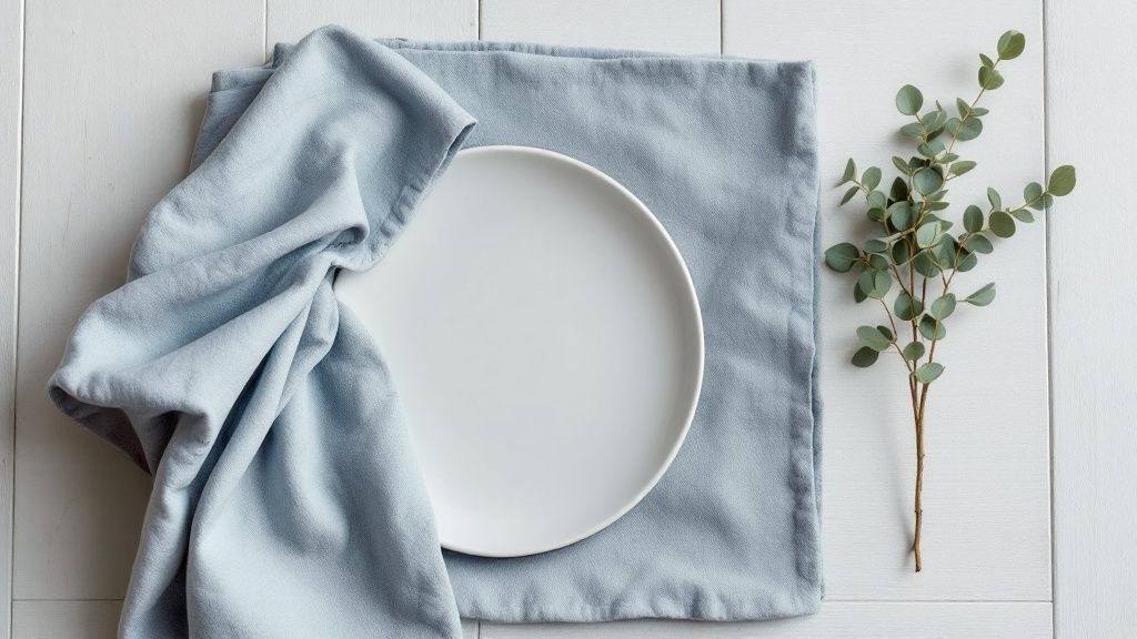
2. Dusty Blue and Sage
Dusty blue and sage are having a major moment in the world of wedding color schemes, and for good reason! This dreamy pairing offers a soft, romantic palette with a touch of earthy elegance. The combination beautifully balances cool and warm undertones, resulting in a harmonious effect that feels both contemporary and timeless. The muted quality of these colors evokes tranquility and sophistication, making it perfect for couples looking for a refined yet natural aesthetic. This color scheme shines particularly brightly for outdoor or garden-inspired weddings, creating a serene backdrop that complements the natural beauty of the surroundings.
This sophisticated color combination, with its natural undertones, creates a peaceful atmosphere that strikes a perfect balance between masculine and feminine energy. It works exceptionally well with botanical or rustic themes, making it a popular choice for everything from barn weddings to elegant garden ceremonies. And let's not forget how beautifully these colors photograph in natural light! Think soft, dreamy images that capture the romance of your special day.
Dusty blue and sage is a versatile choice, adaptable across multiple seasons with just a few tweaks. Imagine incorporating deeper jewel tones for a fall wedding, or lightening up the sage for a fresh spring feel. This adaptability is a huge plus for couples planning weddings across different times of the year. This palette also complements natural settings without overpowering them; your venue's beauty will shine through, enhanced by these soft, complementary hues. As a bonus, these colors are flattering for a wide range of skin tones, ensuring everyone looks their best in photos.
Pros:
- Versatile across seasons
- Complements natural settings
- Flattering to various skin tones
- Easy to incorporate through decor and natural elements
- Creates a cohesive, elegant look
Cons:
- Can appear washed out in certain lighting
- May require extra effort for dramatic impact
- Matching specific shades across materials can be challenging
- Might feel too subtle for those wanting a bolder look
Examples of Dusty Blue and Sage in Action:
Celebrity weddings like Blake Lively and Ryan Reynolds' rustic-elegant affair and Pippa Middleton's celebration featured similar muted blue and green tones, demonstrating the timeless appeal of this palette. Venues like The Inn at Rancho Santa Fe frequently utilize this color scheme for their garden weddings, showcasing its natural elegance.
Tips for Rocking Dusty Blue and Sage:
- Elevate with Metallics: Add silver or rose gold accents for a touch of glam.
- Texture is Key: Incorporate various textures (think linen, lace, wood) to add depth.
- Create Dimension: Use deeper blues or greens as accent colors to prevent a flat look.
- Embrace Natural Materials: Wood, stone, and linen blend beautifully with this palette.
- Watercolor Wonders: Consider watercolor invitations to perfectly capture these soft hues.
This color scheme has been popularized by platforms like Pinterest and Instagram since 2018, with wedding designers like Emily Clarke and publications like Martha Stewart Weddings featuring it prominently in their garden ceremony inspiration. Even the Magnolia brand aesthetic, popularized by Joanna Gaines, echoes this soft, natural palette. Whether you're planning a grand celebration or an intimate gathering, dusty blue and sage provides a sophisticated and serene foundation that’s easy to customize to your unique style. It’s a beautiful option for couples, corporate event managers, private party hosts, charity event coordinators, and creative event planners alike—anyone looking to create a sophisticated and calming atmosphere.
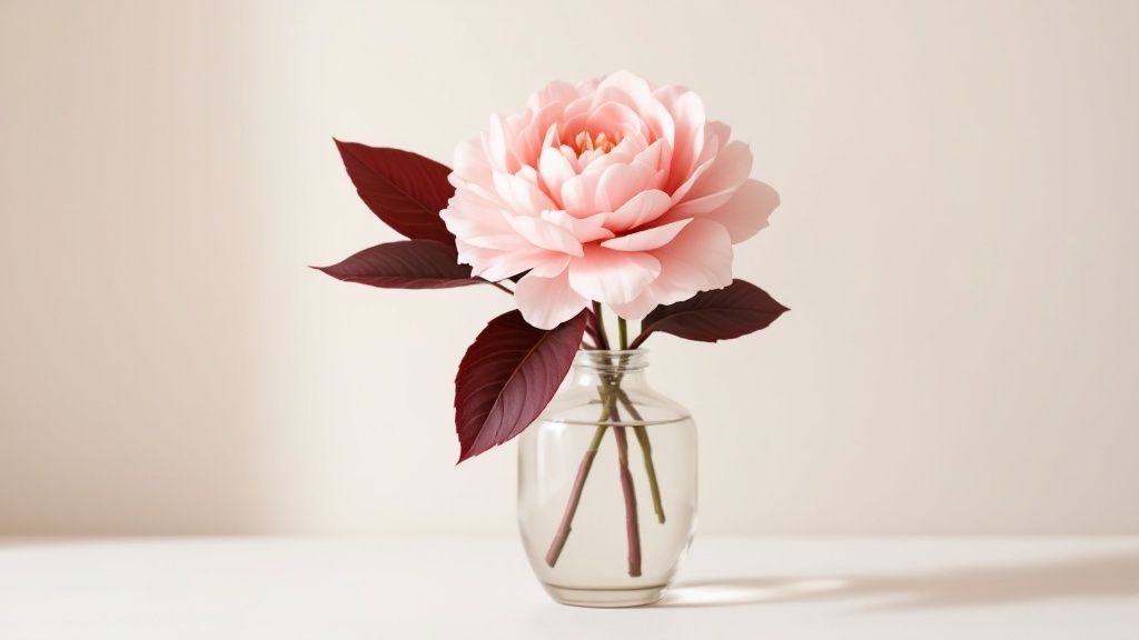
3. Burgundy and Blush
Burgundy and blush is a wedding color scheme that beautifully blends richness and romance. This dynamic duo combines the deep, bold allure of burgundy with the soft, delicate charm of blush pink. The result? A sophisticated palette that's both warm and elegant, perfect for crafting a memorable wedding atmosphere. The contrast between these two colors creates visual interest without clashing, lending itself to stunning backdrops no matter the season. This color scheme is a popular choice because it offers a balance that appeals to a wide range of tastes and wedding styles.
This rich, romantic color combination offers a dramatic contrast that truly stands out. Imagine deep burgundy bridesmaid dresses against a backdrop of blush floral arrangements, or burgundy table runners accented with blush napkins and candlelight. The possibilities are endless! This scheme balances bold and subtle tones, creating visual interest and a warm, intimate atmosphere suitable for both indoor and outdoor venues. It's adaptable, too, working seamlessly with rustic barn weddings just as well as it does with elegant ballroom receptions. Think Priyanka Chopra and Nick Jonas' wedding celebration, or the gorgeous vineyard weddings of Napa Valley – both have showcased the beauty of this color palette. Even garden weddings at venues like the Arizona Biltmore frequently feature this scheme, particularly in the fall.
Pros:
- Photogenic: This palette photographs beautifully in various lighting conditions.
- Unique: It offers a distinctive look that's a refreshing change from more common wedding color schemes.
- Flattering: The colors complement most skin tones and work well with various seasonal aesthetics.
- Flexible: It allows for a wide range of accent color options, from metallics like gold and copper to neutrals like ivory and taupe.
- Accessible: Flowers and decor items in burgundy and blush are readily available.
Cons:
- Darkness: Burgundy can appear very dark in evening or dimly lit venues.
- Overpowering: It requires careful balancing to prevent the burgundy from overshadowing the blush.
- Venue Clashes: May clash with certain venue color schemes (especially oranges or bright greens).
- Heavy Appearance: Can look too heavy if not lightened with appropriate accents.
Tips for Rocking Burgundy and Blush:
- Balance the Palette: Incorporate neutral elements like ivory, taupe, or gray.
- Add Metallic Accents: Gold or copper metallics provide an elegant touch.
- Seasonal Adjustments: For spring/summer events, use burgundy sparingly as an accent color.
- Layered Blush: Use different shades of blush to add depth and visual interest.
- Greenery is Key: Include greenery, particularly eucalyptus, to seamlessly connect the color contrast.
This color combination has risen in popularity thanks to wedding planners like Mindy Weiss, who has featured the palette in celebrity weddings. It gained further traction through fall wedding trends on social media (especially since 2016), and Pantone's choice of Marsala as Color of the Year also helped propel the burgundy trend. Even luxury florist Jeff Leatham has showcased these colors in high-profile events. This enduring popularity makes burgundy and blush a worthy contender in any discussion of top wedding color schemes.
4. Navy and Copper
Navy and copper is a winning wedding color scheme that offers a sophisticated and contemporary feel, striking a perfect balance between cool depth and warm metallic brilliance. This combination provides a refined alternative to traditional black-tie palettes, while maintaining all the elegance and versatility you could want. The rich depth of navy serves as an exquisite backdrop for the eye-catching warmth of copper, creating a palette that feels both timeless and trendy. It's a perfect choice for modern couples who want a distinctive yet classic aesthetic for their big day.
This color scheme works incredibly well for evening and formal events, lending an air of sophistication and glamour. Think candlelit receptions, dramatic uplighting, and shimmering copper accents catching the light. However, it's also highly adaptable to different wedding styles, from industrial-chic warehouses to luxurious ballroom settings. Imagine copper piping details against navy walls in an industrial loft, or rich navy velvet tablecloths accented with copper chargers in a grand ballroom – the possibilities are endless! This versatility makes navy and copper a top contender among wedding color schemes.
Why Navy and Copper Deserves a Spot on the List:
This combination offers a unique twist on classic elegance. It's visually striking, offering a strong, memorable aesthetic. The balance of cool and warm tones makes it appropriate year-round, and it lends itself beautifully to dramatic, Instagram-worthy moments.
Features and Benefits:
- Modern yet timeless: This combination transcends fleeting trends.
- Balanced palette: The coolness of navy is offset by the warmth of copper.
- Sophisticated atmosphere: Creates a refined and upscale ambiance.
- Versatile: Adaptable to various wedding styles and venues.
Pros:
- Universally flattering: Navy complements all skin tones.
- Dramatic visuals: Makes for stunning photographs and memorable moments.
- Formal alternative: A stylish substitute for traditional black.
- Warm accents: Copper prevents the palette from feeling too cool.
- Works with other colors: Pairs well with blush, burgundy, emerald, and more.
Cons:
- Photography challenges: Navy can appear black in certain lighting conditions.
- Tarnishing risk: Copper can tarnish in humid or outdoor environments.
- Potential heaviness: Needs to be balanced with lighter elements to avoid a gloomy feel.
- Venue clashes: May not complement all venue color schemes or wood tones.
Examples of Successful Implementation:
- Celebrities like Justin Timberlake and Jessica Biel incorporated navy and metallics in their wedding.
- Prestigious venues like The New York Public Library have showcased this sophisticated palette.
- Industrial-chic venues like The Foundry in NYC frequently feature this color combination.
Actionable Tips:
- Lighting is key: Ample lighting highlights the reflective beauty of copper.
- Balance with neutrals: Cream, grey, or ivory soften the overall look.
- Copper accents: Use copper sparingly in details rather than large surfaces.
- Texture is your friend: Incorporate navy velvet for a touch of luxury.
- Brighten with florals: White or ivory flowers add a refreshing lightness.
Navy and copper is a truly captivating wedding color scheme. By carefully considering the tips above, you can create a stunning and unforgettable celebration that reflects your unique style and sophistication. This versatile combination has earned its place among the top wedding color scheme choices for its ability to create a memorable, elegant, and visually striking atmosphere.
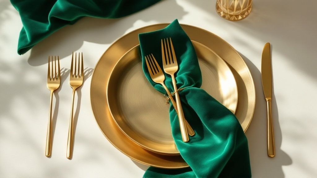
5. Emerald and Gold: A Touch of Regal Opulence for Your Wedding Color Schemes
Want your wedding to feel like a scene straight out of a glamorous Hollywood movie? Then the emerald and gold wedding color scheme might be your perfect match. This luxurious pairing offers a rich, jewel-toned palette that instantly elevates any event, adding a touch of drama and sophistication to your celebration. If you're envisioning a wedding that's both memorable and timelessly elegant, this opulent combination is definitely worth considering.
Emerald and gold work so beautifully together because of their inherent contrast and visual depth. The deep, saturated green of emerald provides a lush backdrop, while the luminous gold accents add a touch of sparkle and glamour. This combination is inspired by nature's most precious elements, evoking a sense of richness and grandeur. This isn't just a trendy color palette; it's a classic pairing that exudes a regal, almost majestic quality.
Think this color combo might be for you? Let's dive into the specifics:
Why Emerald and Gold Deserves a Spot on the Best Wedding Color Schemes List:
This color scheme isn't just pretty; it's incredibly versatile. It works beautifully in a variety of settings, from formal ballroom weddings to intimate garden ceremonies. Plus, it photographs amazingly well, ensuring your wedding photos will be vibrant and captivating for years to come. Remember Catherine Zeta-Jones and Michael Douglas's stunning Plaza Hotel wedding? Emerald green played a key role! Even celebrity event planner David Tutera has used this palette for numerous high-profile events, proving its staying power.
Features and Benefits:
- Luxurious and Rich: This jewel-toned palette instantly creates a sophisticated atmosphere.
- Bold and Dramatic: The high contrast between emerald and gold offers striking visual interest.
- Timelessly Elegant: This classic pairing never goes out of style.
- Versatile Design Style: Adaptable to various themes, from Art Deco to botanical.
- Year-Round Versatility: Works for any season, with easy adaptations for different times of the year.
Pros:
- Memorable Impression: Your guests will definitely remember this unique and stylish color palette.
- Photogenic: The rich, saturated colors look stunning in photographs.
- Versatile: Works well with many floral options and décor styles.
- Dramatic Decor Moments: Creates eye-catching tablescapes and other decorative elements.
Cons:
- Potential Overwhelm: Can feel overwhelming if not balanced with neutrals like ivory or cream.
- Color Matching: Emerald can be tricky to match perfectly across different materials.
- Lighting Requirements: Needs proper lighting to showcase the depth of the emerald green.
- Venue Conflicts: May clash with pre-existing color schemes in some venues.
Actionable Tips for Using Emerald and Gold:
- Balance the Intensity: Incorporate cream or ivory to soften the boldness of the emerald and gold.
- Strategic Emerald Placement: Use emerald in smaller doses for linens, glassware, or floral arrangements.
- Textural Elements: Consider luxurious velvet emerald fabrics for drapes or table runners.
- Gold Variety: Mix different gold finishes (matte, shiny, antique) to add depth and dimension.
- Art Deco Twist: Add black accents for a sophisticated, Art Deco-inspired interpretation.
When and Why to Use This Approach:
This color combination is perfect for couples who want a wedding that feels luxurious, sophisticated, and unforgettable. If you're drawn to rich colors and glamorous details, emerald and gold will create the perfect ambiance for your special day. It's particularly well-suited for formal or evening weddings, but can be adapted for other settings as well. The popularity of emerald was spurred on by it being Pantone's Color of the Year in 2013, and the trend hasn’t slowed down, frequently being featured in luxury fashion houses and interior design, influencing wedding color schemes ever since.
From glamorous galas at The Breakers Palm Beach to intimate gatherings, emerald and gold offers a versatile and visually stunning backdrop for any celebration. This is one wedding color scheme that truly stands the test of time.
6. Lavender and Grey: A Touch of Whimsy Meets Modern Chic
Looking for wedding color schemes that exude both elegance and tranquility? Lavender and grey might be your perfect match. This dreamy duo offers a sophisticated take on traditional purple palettes, blending the soft, romantic hues of lavender with the contemporary neutrality of grey. It's a versatile combination that works beautifully for a range of wedding styles, from rustic chic to modern minimalist.
This color scheme works by balancing the feminine charm of lavender with the grounding effect of grey. The ethereal quality of lavender brings a touch of whimsy and romance, while the grey provides a sense of stability and sophistication. This balance creates a visually appealing and emotionally calming atmosphere, perfect for a celebration of love.
Why Lavender and Grey Deserves a Spot on Your Mood Board:
This palette offers a subtle pop of color without being overwhelming. It’s incredibly photogenic, especially in natural light, guaranteeing stunning wedding photos with a soft, romantic feel. Plus, it's surprisingly versatile! Whether you're envisioning a garden ceremony or an elegant ballroom reception, lavender and grey can adapt to various settings.
Features and Benefits:
- Soft, Romantic Palette with Modern Appeal: This combination seamlessly blends classic romance with contemporary style.
- Serene and Calming Atmosphere: The soft hues create a peaceful and relaxing ambiance for you and your guests.
- Subtle Sophistication: Offers a touch of color without being overly bold or vibrant.
- Highly Photogenic: Lavender and grey capture beautifully in natural light, creating dreamy, ethereal wedding photos.
- Versatile for Various Settings: Works well in both indoor and outdoor venues, from rustic barns to elegant ballrooms.
Pros:
- Gentle on the Senses: Provides a soft color story that doesn't overwhelm.
- Flattering to Most Skin Tones: Both lavender and grey complement a wide range of complexions.
- Easy to Accessorize: Pairs beautifully with metallic accents like silver, gold, and brushed nickel.
- Creates Romantic Photos: Lends itself to soft, dreamy wedding photography.
- Adaptable to Various Wedding Styles: Works with rustic, vintage, modern, and other themes.
Cons:
- Lighting Sensitivity: Can appear washed out in certain lighting conditions, so careful consideration is needed.
- Subtlety: May not be vibrant enough for couples seeking a bold color statement.
- Seasonal Availability: Fresh lavender can be seasonally limited or expensive.
- Potential for Coldness: Grey can feel cold if not balanced with warmer elements like wood or candlelight.
Examples in Action:
- Chelsea Clinton's wedding incorporated lavender and subtle grey elements for a touch of understated elegance.
- Venues like The Lavender Farm at San Ysidro Ranch naturally showcase this stunning palette.
- Provence-inspired weddings often feature authentic lavender and grey décor.
Tips for Incorporating Lavender and Grey:
- Layer Shades: Use different shades of lavender and grey to add depth and visual interest.
- Metallic Accents: Incorporate silver or brushed nickel for a modern, sophisticated touch.
- Natural Textures: Use linen, stone, and wood to enhance the organic feel of the palette.
- Lavender Sprigs: Incorporate fresh lavender sprigs for décor and a subtle fragrance.
- Watercolor Effects: Consider watercolor stationery to capture the softness of the colors.
Popularized By:
- Martha Stewart Weddings has featured numerous lavender farm ceremonies, bringing this color scheme into the spotlight.
- Pinterest saw a surge in lavender and grey wedding trends around 2016-2018.
- Provence-inspired wedding aesthetics have further popularized this romantic combination.
- Wedding photographer Jose Villa’s light and airy style often showcases these tones beautifully.
This sophisticated and serene color palette is a fantastic choice for couples seeking a romantic and modern wedding atmosphere. By following these tips and drawing inspiration from real-world examples, you can create a truly unforgettable celebration with lavender and grey as your guiding hues.
7. Coral and Teal: A Vibrant Splash for Your Wedding
Coral and teal: it's a wedding color scheme that evokes the energy of a tropical ocean and the joy of a perfect summer day. This dynamic duo effortlessly blends warm and cool tones, resulting in a refreshing and contemporary aesthetic that's sure to make a splash. If you're envisioning a wedding bursting with vibrant color and a touch of playful sophistication, coral and teal might be your perfect match. This popular choice deserves its spot on our list of top wedding color schemes for its ability to create a truly unforgettable celebration.
This vibrant, high-energy color combination offers a strong visual impact, instantly creating a joyful, celebratory atmosphere. The contrast between coral and teal provides excellent visual interest, capturing attention and making your wedding photos truly pop. It's particularly well-suited for outdoor, beach, or tropical settings, naturally complementing the beauty of nature. If you're looking for a distinctive statement that stands out from more traditional palettes, coral and teal is an excellent choice.
Why Coral and Teal Works:
- Bright, Cheerful Photos: Say goodbye to washed-out wedding photos! Coral and teal create a vibrant backdrop that guarantees stunning, memorable pictures.
- Instant Festive Mood: These colors instantly set a festive, uplifting mood, perfect for celebrations of love and happiness.
- Destination Wedding Dream: Whether it's a beachside ceremony or a tropical garden party, coral and teal works beautifully for destination or summer weddings.
- Versatile Shades: From light peach to deep coral, and aqua to deep teal, this palette offers a wide range of shades to suit your personal style.
- Pops Against Neutrals: Decorative elements in coral and teal truly pop against neutral backgrounds like white or ivory.
Things to Consider:
- Balance is Key: While vibrant, coral and teal can feel overwhelming if not balanced with neutrals. Plenty of white or ivory can help soften the impact.
- Venue Compatibility: This bold palette may clash with certain venue color schemes, so consider your location carefully.
- Not for Traditionalists: This less traditional choice might not appeal to all family members, so be prepared for some potential feedback.
- Styling Matters: Coral and teal can potentially look dated if not executed with contemporary styling.
Tips for Rocking Coral and Teal:
- Balance with Neutrals: Incorporate plenty of white or ivory to prevent the brightness from becoming overwhelming.
- Strategic Color Placement: Consider using coral primarily in flowers and teal in decor elements like table runners, napkins, and stationery.
- Metallic Accents: Add metallic gold accents to elevate the palette and add a touch of glamour.
- Natural Elements: Incorporate natural elements like driftwood or sea glass for coastal-themed weddings.
- Dominant Coral: Use coral as the dominant color with teal as an accent for a more sophisticated approach.
Real-World Inspiration:
- Tropical destination weddings in Bali and Thailand frequently feature this stunning palette.
- The Breakers Palm Beach offers this as a signature color scheme for their beach ceremonies.
- Miami Beach weddings have popularized this vibrant combination for oceanfront celebrations.
Trending Influence:
This color combination's popularity has been fueled by various factors, including Living Coral's designation as Pantone's Color of the Year in 2019, the influence of resort fashion on wedding design, the rise of Instagram-worthy destination wedding aesthetics, and the endorsement of renowned wedding designers like Colin Cowie, who has featured this palette for beach weddings.
If you're looking for a wedding color scheme that’s both energetic and elegant, coral and teal is a fantastic choice. By following these tips and considering the potential challenges, you can create a wedding that’s as vibrant and memorable as your love story.
8. Black and White
If you're looking for wedding color schemes that exude timeless elegance and sophisticated style, look no further than the classic combination of black and white. This high-contrast palette offers a striking visual impact that works beautifully in a variety of settings, from ultra-modern lofts to historic mansions. It's a choice that seamlessly blends classic formality with modern minimalism, making it a perpetually chic option for your big day.
This isn't just a trendy choice; black and white is truly timeless. Think classic photography, think formal traditions – this palette has deep roots in enduring style. Choosing black and white means your wedding photos will look just as stunning decades from now as they do on the day itself. You won't be cringing at dated color choices twenty years down the line!
Why Black and White Works:
- Timeless Elegance: This palette never goes out of style. It's the epitome of chic sophistication.
- Maximum Contrast: The stark contrast creates a visually arresting look that's both dramatic and refined.
- Versatile Venue Choice: Whether you're getting married in a sleek, modern art gallery or a grand ballroom, black and white complements any architectural style.
- Showstopping Photography: Your wedding photos will have an editorial quality, capturing the drama and elegance of the day.
- Flattering on Everyone: Black and white is universally flattering to all skin tones and hair colors, ensuring your entire wedding party looks their best.
- Easy Coordination: Sourcing attire and decor in black and white is incredibly straightforward, streamlining your planning process.
Pros & Cons:
Pros:
- Never looks dated in photographs
- Easy to source materials and attire
- Creates a cohesive and harmonious look
- Provides a perfect backdrop for a statement color (if desired)
- Flattering to everyone in the wedding party
Cons:
- Can feel austere without proper lighting and texture
- May lack a personalized touch for some couples
- Requires careful planning to avoid a monotonous look
- Black can absorb heat in direct sunlight (consider this for outdoor summer weddings)
Making Black and White Your Own:
Here's how to elevate this classic wedding color scheme and make it truly yours:
- Texture is Key: Incorporate a variety of textures like velvet, silk, satin, lace, and sequins to add depth and visual interest. This prevents the look from feeling flat or one-dimensional.
- Metallic Accents: Gold, silver, or a combination of both, can add a touch of glamour and elevate the overall aesthetic.
- Lighting Magic: Dramatic lighting can truly transform a black and white space, enhancing the contrast and creating a magical atmosphere.
- A Pop of Color: While black and white is stunning on its own, consider incorporating one small pop of color, like red roses or emerald green accents, for a dramatic effect.
- Shades of Sophistication: Don't limit yourself to just stark black and bright white. Layering different shades of gray, ivory, and off-white adds depth and sophistication.
Inspiration & Examples:
Think Kim Kardashian and Kris Humphries' dramatic black and white wedding, or the elegant black-tie affairs regularly hosted at The Plaza Hotel in New York. Even iconic designer Vera Wang has built her bridal reputation partly on the power of black and white design. These examples showcase the enduring appeal and versatility of this classic pairing.
Influencers:
The enduring power of black and white in event design can be attributed to several key influencers: Coco Chanel's influence on fashion and aesthetics, celebrity wedding planner Preston Bailey's dramatic black and white designs, fashion photographers like Richard Avedon who brought an editorial style to weddings, and timeless films like Breakfast at Tiffany's that continue to inspire event design.
Ultimately, black and white offers a sophisticated and stylish foundation for any wedding. By carefully considering texture, lighting, and the potential for small pops of color, you can create a truly memorable and personalized celebration that will stand the test of time. This classic choice deserves its place among the top wedding color schemes for its enduring elegance and versatility.
Top 8 Wedding Color Schemes Comparison
| Color Scheme | Implementation Complexity 🔄 | Resource Requirements ⚡ | Expected Outcomes ⭐📊 | Ideal Use Cases 💡 | Key Advantages ⭐💡 |
|---|---|---|---|---|---|
| Classic White and Gold | Moderate – straightforward sourcing, requires lighting balance | Moderate – common materials, versatile budget | Elegant, timeless, bright atmosphere | All seasons, formal and informal weddings | Timeless elegance, versatile, photogenic, easy to source |
| Dusty Blue and Sage | Moderate – requires shade matching and texture layering | Moderate – natural elements and metallic accents | Serene, soft, natural elegance | Spring/fall, garden and outdoor weddings | Sophisticated, flattering, blends with nature |
| Burgundy and Blush | Moderate – balancing bold and soft, careful color distribution | Moderate – common floral and decor availability | Warm, romantic, dramatic contrast | Fall/winter, rustic to formal settings | Distinctive, flattering, versatile accent options |
| Navy and Copper | High – needs lighting to balance reflectivity and avoid heaviness | Moderate – copper care required, velvet textures | Sophisticated, dramatic, elegant | Evening, formal, urban and industrial venues | Modern elegance, memorable visuals, versatile accents |
| Emerald and Gold | High – matching jewel tones, balancing intensity | Moderate to high – rich materials, lighting needs | Luxurious, bold, regal atmosphere | Fall/winter, formal and glamorous events | Distinctive, photographs richly, versatile with neutrals |
| Lavender and Grey | Moderate – layering shades, seasonal flower availability | Moderate – floral seasonal constraints | Soft, calming, refined | Spring/summer, indoor and garden settings | Gentle palette, photogenic, easy metallic pairing |
| Coral and Teal | Moderate – balancing vibrant, contrasting tones | Moderate – vibrant flowers and décor needed | Bright, joyful, energetic | Spring/summer, tropical, beach weddings | High energy, festive, flexible with shades |
| Black and White | Moderate to High – requires texture and lighting to avoid flatness | Low to moderate – readily available materials | Timeless, sophisticated, high contrast | All seasons, formal and editorial-style weddings | Never dated, cohesive, versatile with statement colors |
Creating Your Dream Wedding with 1021 Events
From the timeless elegance of classic white and gold to the modern chic of black and white, the perfect wedding color scheme sets the tone for your entire celebration. We've explored a variety of popular combinations, including romantic pairings like dusty blue and sage, burgundy and blush, and lavender and grey, as well as bolder choices like navy and copper, emerald and gold, and coral and teal. Mastering the art of choosing a color scheme is crucial, as it influences everything from your invitations and floral arrangements to the linens and lighting, creating a cohesive and visually stunning atmosphere.
Finding the right balance and visualizing how your chosen palette will come to life in your venue can be challenging. If you're looking for ways to visualize your wedding color scheme in your venue, consider using Augmented Reality Room Design tools. These tools can help you see how different colors will look in the space and make sure everything coordinates perfectly. This visualization can give you the confidence that your wedding color schemes will translate beautifully into a real-world setting.
Ultimately, the most important factor is choosing a color palette that reflects your personal style and creates the atmosphere you envision for your special day. The impact of the right wedding color schemes can transform a simple event into a truly unforgettable experience, leaving a lasting impression on you and your guests.
Ready to bring your dream wedding to life? 1021 Events specializes in creating stunning celebrations, perfectly tailored to your chosen wedding color schemes. From cutting-edge technology to personalized touches, we handle every detail. Contact 1021 Events today to begin planning the wedding of your dreams.